Statement of intent
For my first theme I shall focus on producing a website on the theme on texture. This could be in man-made locations such as cities or in nature. Once finished at the the end of the course work time and once I got all of the photos needed , I will present all of the best ones in my final gallery or put them in my best and worst an best and just describe them to the best of my ability. I could even edit them in photoshop when we learn how to use it to our fullest potential .
When doing this topic, I will find photographers to than look at there work and write about it. I will look into the photographer Edward Weston and all of his work on fruit, this is because I will be taking similar pictures to his in class and as studio shots. This shall inspire me when taking my own pictures of fruit and vegetables because I can take a picture of the inside patterns of the fruit and vegetable , just like how Edward Weston has done in some of his work. I can also change the lighting in the room to also make some of my images similar to his. I will compare Edward Weston's work to some one else's like the photographer Paul Strand, to than show the similarities an differences between both photographers. I have picked Paul Strand because of the way a group of his images have been presented to make one image, like a collage. From looking at both of their work , I hope to be inspired by them and to help me start my journey on finding what I want to do for my final gallery and also to help me learn new techniques to use in the future.
When I was first given this theme I was thinking of man-made things such as bricks and natural things such as grass. When thinking in more depth about the topic, I think I will find locations where good pictures can be taken and also look at the weather to than get in more texture in the photos. I believe when doing photoshop I can experiment a lot with the natural and man-made textures, for example I could cut up images so on one side I could add natural textures whilst on the other side is man-made textures .
When thinking of starting steps I will make a mind map to than show both man-made examples and natural examples on one mood board. I will most likely take photos on natural things first such as fruit just so we can figure out how to use the camera and to get our first ever photos on to our website , that will also be most likely made before taking pictures. I will most likely take photos on different man-made objects I can find to act as a contrast to the natural texture and to not only have natural objects on our website. I keep all my pictures on my website even if they seem really bad so I can show my journey on how my pictures have improved over time.
When taking photos we shall use the manual DSLR Canon camera but when doing home work I shall use my phone. I shall zoom in and out with the camera and change some other modes on the camera, for example the white balance, ISO, aperture and shutter speed. I shall use websites such as Weebly to make my website on it , photoshop to than change up my images for the better and the website coggle to make any mind maps , so I show ideas on what I want to do and to show example of things like examples on what you can see in nature .
I will firstly make a website on Weebly to than make sure all of my work is together. I will also make a mind map to than make an idea of all of the work I will do. As I practice taking photos with the camera I will also talk about two photographers of my choice , so they can inspire me in to deciding on what to do next. After that I will pick out two images. One that is my worst whilst the other one that will be my best in my opinion , to than talk about them both so I will know how to improve my work . I will finally work on using photo shop and than add our finished best photos to be in my final gallery.
Shoot plan
Mind map

Mood boards
Natural


Man made


Research
Edward Weston

Context
I have been researching the photographer Edward Weston and the information is taken from Edward-Weston.com.
"He began photographing at the age of 16 after receiving a Bull's eye #2 camera from his dad "
"Weston's first photographs captured the parks of Chicago and his aunt's farm"
"Weston began his work for which he is most deservedly famous for : natural forms, close-ups and landscapes"
"Weston made a series of monumental close-ups of sea shells, peppers and halved cabbages"
To expand my research I also looked at the Tate website and found some interesting information about him.
"Edward Henry Weston (March 24, 1886 – January 1, 1958) was a 20th-century American photographer. He has been called "one of the most innovative and influential American photographers" and "one of the masters of 20th century photography." Over the course of his 40-year career Weston photographed an increasingly expansive set of subjects, including landscapes, still life's, nudes, portraits, genre scenes and even whimsical parodies. It is said that he developed a "quintessentially American, and especially Californian, approach to modern photography" because of his focus on the people and places of the American West. In 1937 Weston was the first photographer to receive a Guggenheim Fellowship, and over the next two years he produced nearly 1,400 negatives using his 8 × 10 view camera. Some of his most famous photographs were taken of the trees and rocks at Point Lobos, California, near where he lived for many years".
Composition
This image is taken from a photographer named Edward Weston. In this image the object seems to be a cabbage that is white with a bit of grey, whilst the back ground is fully black. In my option I think he has used Infinity curve because of this the cabbage is standing out a lot as we are not distracted by anything in the background, it is pitch black. It also seems that the light is coming from the top right and because of this, it is making the veins have the light on it, whilst the parts in between them will have the shade, making us able to see more texture. The contrast of black and white and the fact that one half is exposed to the light and the other half is not, creates a shallow depth of field. The light makes the veins stand out and so they become curved leading lines, my eyes are drawn to the top right hand corner and flow down to the bottom left taking me on a journey and making me interact with the image. Also I can see that Weston has used the rule of 3rds with the light, creating a sweet spot at the top of the biggest vein which pulls your eyes to this part of the image. However, the cabbage sits in the middle of the image and is quite symmetrical and creates a strong triangular shape making you focus at the top of the cabbage, as this is a strong compositional technique. In my opinion I believe the Camera was placed on a tripod to avoid the camera shake as he would of had a longer shutter speed because of the darkness, this means this was a studio shot rather than on location. This image is tightly cropped to the picture plane and the image was taken at eye level, creating a feeling of interest and making us look at the beauty and the form of this cabbage even though it is a humble object. One final point about this image is that photography was not made around this time causing anyone who wanted to take photos, to use film rather than the digital we use to this day. This also means he could have never used photoshop, making this image look even better than before. For me personally I like the image due the amount of texture and detail put into this work and because of that I might use some off the techniques on any other work I do .
Connections
Edwards Weston can inspire me when taking my photos, especially because of the topic we are currently developing, which is texture. In his work I can see that he wants to bring out the beauty and the patterns in texture which will be a good starting point for me. He has also used a studio set-up with quite dramatic lighting which is a technique I might want to use. He is well known for taking pictures of fruit and vegetables which is also a thing I will be doing. The connection he is making by taking photos of a single object is the tradition and method of 'still life'. Artists have used still life subject matter for centuries and I have been researching the connections between Weston's work and this tradition. I went on the Tate website and found a painting of a cabbage which I think links to Weston's work. Here is the link Cabbage Still Life Painting by Vincent Yorke - Fine Art America
The artist has shown more of the form and shape of the full cabbage and we can also see the veins and some texture, however the image looks flatter, whereas Weston's photo of one leaf shows a lot more detail.
The artist has shown more of the form and shape of the full cabbage and we can also see the veins and some texture, however the image looks flatter, whereas Weston's photo of one leaf shows a lot more detail.

Comments
In my opinion I do like this image for a few different reasons, such as the amount of texture shown is amazing. Another reason would be how it stands out from the background because the background is fully black whilst the cabbage is a mix of white and grey. This makes the cabbage stand out a lot and is very effective. Something else I like will be the use of the rule of thirds because it has been used well and that your eyes are drawn to the top right of the cabbage. On the other hand people may disagree with me and not like this image because of the lack of colour and that it may look better from a different angle.
Paul Strand

Context
I have been researching the photographer Paul Strand and the information I have learnt about him is from the website Paul Strand | American Modernist Photographer | Britannica . “He influenced the emphasis on sharp-focused , object images in the 20th century”. The word emphasis means a forceful quality in a way something is said or written. “When he was 17 he began to study photography”. “Many works from other people inspired to emphasize abstract form and pattern in his photography” “Strand deliberately destroyed perspective to build a powerful composition from tonal planes and rhythmic pattern” Paul Strand had also “served in the 1st world war” to come back and to mainly only do “photography in their free time”. It seems in his life he collaborated with many people a lot during his life and explored different themes and techniques, I will use this to inspire my own work.
Composition
In this image from the photographer that I chose, I have to guess that there are ceramic forms put next to each other in a way that would make a very interesting pattern. The shapes are interlocking and flowing which makes your eye go on a journey and in a particular direction when looking at the image. I can see strong leading lines created by the four tops of the vessels, this adds interest and movement to the image. I can't see the rule of thirds being used in this composition but I can see that a rim of a vessel sits right in the middle of the image and this technique draws your eye into the center of the photograph.
It seems that the image goes from being darker at the top to lighter at the bottom, it is almost bleached out at the edge of the image. This is an interesting use of monochromatic technique and makes the image standout a lot more and eye-catching when looking at it. When looking at this image your eyes are drawn to the bottom middle due to it being the lightest part of the image. There is a deep contrast between the shadows in the vessels and the bleached out tops that brings out the texture and form of the shapes and we focus on it more to properly to understand the image to its fullest potential. In my opinion I feel that the lighting is natural and not a set-up studio shot. They may of had the camera on a tripod, the ISO at 100 and a shallow depth of field, around Fstop 6 perhaps.
This image has been very tightly cropped but it works well as you cannot see any of the background, just the flowing forms of the vessels. The forms are very close to the picture plane, it is all foreground, there is no midground or distance which makes us relate to the forms.
I can see that the image has been taken looking down at the objects because we can see some of the inside and the dark shadows created by the forms. By looking down, it adds interest to the shot, in my opinion the shapes become more interesting and engaging. This is what caught my eye when I was doing my research and might be something I can use in the future. I personally like this image for its simple but big shapes and patterns. From knowing this I can easily use these methods in the different work I do in the future.
Connections between Paul Strand & Alfred Stieglitz

Paul Strand can help me improve my photography in the future by making me think about different viewpoints and how cropping an image can have a big impact. My research will me come up with ideas on how to improve an image when using photoshop. Another connection I will make is from a photography piece by Alfred Stieglitz. In this piece it reminds me of Strands work because it almost looks like that the skill monochromatic has been used in this. Another thing that reminds me of the work is that they both do not use small shapes and patterns except for the button on the image of Alfred Stieglitz . In the Stieglitz image it seems to show two hands . These two hands are holding on to a blazer. A blazer that does kind of blend into the background a lot. The main thing you can see on the blazer is a button. I can also tell that he has beautifully used the rule of 3rd’s to add to the eye catching ness of the image by putting the main focus point that is the hands in the middle . I do personally like both of their works due to the fact that I am able to use ideas from both photographers due to them being very similar to one another.
Comments
In my opinion this is definitely what I want to do in my work. I personally want to do the split canvas technique but use different shapes and use pictures with different multiple patterns just like the image I chose to represent Paul Strand. Something I will make different with my work is that I will not use the monochromatic technique in my work as I want to express my work with colder colours.
Natural texture
Corn


Mushrooms


Peppers


Cabbage


Best
In my opinion, I believe that this image is my best . The use of the rule of 3rds draws your eyes to the middle of the vegetable, for than to move around following the various patterns that would take you on a journey. Another reason would be that the way I zoomed into the image. When I did, it made part of the darker part of the vegetable to be seen on the bottom left side of the image but it managed to work in my favor and just add more life to the image making it look more 3D.
|
Worst
In my opinion, I believe that this image is the worst. The use of the zoom feature on the camera caused the image to be tightly cropped and even cutting out one of the two vegetables. Another reason this is my worst is that the focus is very off so the dial has not been set to the middle before taking the picture. One of the main problems was the constant shacking of my hands. Personally my hands would only shake if I am very stressed because of this I started to use a mini tripod to see if that would help my shacking problem. It did help once I understood how to use it until I stopped using it because I felt that I was comfortable with out it. I also need to watch out for the shutter speed making it not to fast when clicked. Those are just 2 ways to make this image better in the long run.
|
Shells


Parts of a tree


Leaves


Grass


These 4 pictures of green grass was from the trip into Manchester
Trip into Manchester
Some of the natural pictures
I went on a location shoots into Manchester, to capture different types of photographs to help expand my portfolio of images. When in Manchester I had to change many of the settings on my camera as I went around taking many images because of the difference in light levels. I had to learn to adjust the settings each time I changed direction, for example the exposure, aperture and shutter speed. I had focused on taking pictures of different building and zoomed in on the texture of bricks, metal and glass. As a contrast I also focused on doing flowers, grass and even water movement to get a more clearer understanding on the different settings on the camera as well as looking at different types of texture.
Flower


Berry


Best and worst

|

|
|
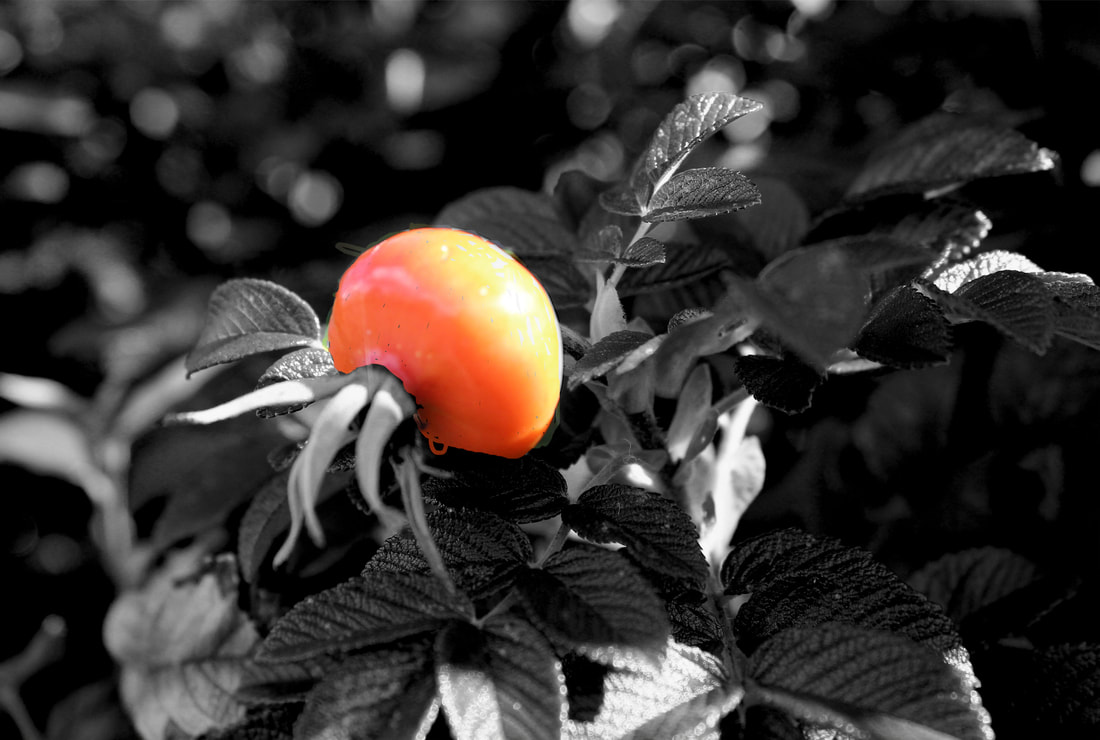
In my opinion this is the best image. A few reasons would the usage of the rule of 3rds that makes your eyes be drawn to the berry , but mainly the top middle where the light would rap over the berry. Speaking of the light, it seems that I have only used natural lighting and not added any more of less light, bringing it more life and less likely mess up the image. Something else that grabs my attention is how in the background it is very hard to see. It seems that the camera has only focused on the berry and some surrounding leaves, causing our eyes to mainly be drawn to the berry and is not able to be distracted by anything else.
|
In my opinion this image is the worst. When thinking of reasons this is the worst I have found that I must have accidently zoom in too much causing the berry to be straight in your face when you look at this image. To explain the blur it must be from a simple slight shake of the camera or the dial was not set right to the correct spot. Next time I shall try my best to prevent this from happening by keeping the camera still and making sure the settings are put on correctly.
|
Edit on photoshop


Before |
After |
|
|

|
This is my first time on photoshop to change how an image looks. I have 1st cropped the image to than changed it to black and white to reference Edward Weston's photo of the cabbage. I believe that next time I would want to test more things out to make the image look different and also I need to take more screen shots so anyone can understand what I have done.
Developing editing on photoshop.


Before |
After |
|
|
|
This time I had used the erase tool to erase the black and white layer to then let us see the normal colors. I only did this to the berry as it is the main thing I want to stand out and because it is the only red thing on the whole image due to there is only one berry and everything else is leaves. I believe that I could improve this is by making the whole berry in color including the Next time I shall make sure I do even more screen shots and just experiment with even more things.
Water


Trip into Paddle Gorge
For the 2nd trip of year 10 we got to go to Paddle Gorge. It resides in the peak district. This is between the road A6187 and the village of Gindleford . From the school it shall take around an hour and a half. That is for each way. During the trip I would have to always change the camera settings for example I could change it to sports mode or the zoom in feature to better capture the image.
I personally found the trip to be a bit difficult at times due to the switching the features on the camera or the moving around. This was due to the fin paths and the mud that acted like quick sand that would steal your shoe. There are more reasons but over all I did in joy this trip out to Paddle Gorge.
I personally found the trip to be a bit difficult at times due to the switching the features on the camera or the moving around. This was due to the fin paths and the mud that acted like quick sand that would steal your shoe. There are more reasons but over all I did in joy this trip out to Paddle Gorge.

|

|

|
These 3 pictures out of all of them are my favorites. The 1st two images had a feature on the camera called zoom. The symbol was a flower. It seems to help the camera focus on some parts on the image. For the last photo it appears the method used is called sports mode. The symbol being of a man running. This mode can capture movement of a person running or water moving around with out the image getting too blurred. I personally like how I have captured the water moving around and hitting against the rock that resides in the middle of the image. I feel like I also like the 1st two just due to all of the textures that were pulled out a lot when taking the picture with the features I have used.
Paddle Gorge trip natural picture
When going into Paddle Gorge there was multiple different natural things to take pictures of and also we had many different opportunities to use the different camera settings as we explored the place.
Water


Rocks


Best
This is personally the best picture due to the rock hitting more than one sweet spot and standing out even more due to it being in the foreground and not the back ground.
|
Worst
I believe this is the worst image out of the ones with a rock that looks like a circle. This is due to how your eyes are drawn to the blue t-shirt and it hitting a sweet spot perfectly but the rock does not.
|


Not zoomed in trees


Best
This is personally the best image due to the exotic shape of the tree and how because of that we will mainly focus on the the tree and nothing else.
|
Worst
This is personally the worst due to the image being blurred due to either hand shaking or some of the settings were miscalculated that than results into an image like this.
|


Zoomed in trees


Branches


Mushrooms


Flowers


Leaves


Moss


Paddle Gorge - discarded objects
For my personal project I chose objects (loved and discarded) thou I enjoy doing the project, Paddle Gorge was not the place to get pictures for the project but I was some how in luck to find some old , forgotten cloths just left behind by some one. There was not many but I was still surprised every time I saw even just one t-shirt or cardigan that was left behind and forgotten.


Paddle Gorge man made pictures
Train tracks


Tunnel


Best
I seemed to of struggled taking pictures of the tunnel probably due to the pictures of the tunnel was the 1st group I took whilst on the trip. After looking over all of them this one is the best one. By this time I got the main problem for the worst image fixed. I do say to improve I should of got a shot where the tunnel is in the middle of the shot instead of to the side like this image.
|
Worst
I believe this image is the worst. I have figured out that then I did not change the stetting's nor had put the dial that would appear only if you half push down the button that you press to take a picture was not either in the middle and had to go a bit left or it had to go into the middle.
|
House


Brick walls


Railings


Bridge


Best
|
Worst
|
|
I believe this is the best due to the use of framing that is shown how when we look at the stairs in the background the railings act as a frame to draw our eyes to the background . I also believe that the greenery in the background complements the bridge very well due to it now looking like if the bridge belongs in the woods.
|
Even after looking at the images I can say there all not too bad even thou with some like this one is slightly darker due to a similar problem with the worst tunnel image.
|


Man-made texture
Crate


Part of doors


Lock


Fence


Fan


Trip into Manchester
Wheel


Floor


Metal


Walls


Wristbands


Part of a gate


Decorative walls


Bricks


Bridges


Best
In my opinion this is my best image. Unlike the worst photo this image is in focus and the cropped side of of the image has been done well. It has a strong composition as I have used the rule of thirds, with the bridge being in two thirds and the sky in the top third. The curve of the bridge acts as a frame to the image and pulls your eye into the surface of the water. If I develop the image in Photoshop, I might adjust the contrast and saturation a bit to make the contrasts stand out a bit more.
|
Worst
In my opinion this is my worst image. To start of the image is blurred. This may be caused by movement most likely hand shake. This also may be caused by the camera not being in focus. Another problem is how the picture is cropped. Parts of the image that should not of ever been needed like the top right is still there and is badly cropped in half.
|
Next time I must try to stay still during taking the photo and try to crop out the unnecessary details in the image.


Railings


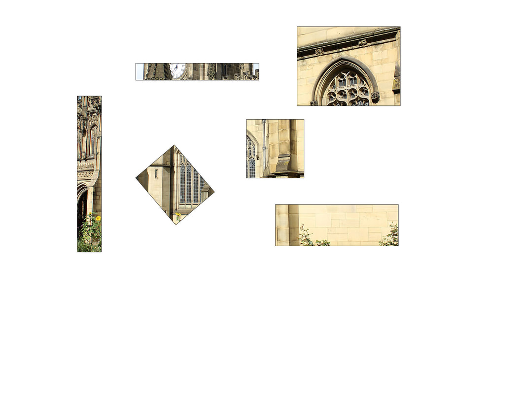
Cathedral


Building


Best and worst

In my opinion this image is the best. It seems that with the picture being portrait it will make the image look better as you can see the whole building. The rule of 3rds draw your eyes to the middle of the main building due to how the color would stand out from anything else. I personally believe that a way to improve the image is to change the camera angle only a bit to make it more straight. Other than that I believe the picture is good.
|

In my opinion the image here is the worst. A reason would be the camera shaking and the focus not being the best. I also believe that the rule of 3rds was not used that well and the the camera was slightly put at an awkward angle causing the image to look badly cropped. I will improve my self next time by making sure that the camera settings is put on correctly as I will also try to keep the camera as still as possible.
|
Skyscraper


Best |
Worst |
|
In my opinion this image is in fact the best. The rule of 3rds cause your eyes to be drawn to the middle far left of the building. Another reason why this is good is the zoom, because of the way it is zoomed in causes you to see a good chunk of the building, but what also links is the use of the camera angle. It seems it is portrait making it easer to see the building.
|
In my opinion this image has to be the worst. I believe the main problem is the focus because it is very off and the camera may have moved a bit, causing it to be blurred when viewing the picture after taking it. Next time I shall make sure the focus is corrected before taking the photo and try my best not to shake if it did originally add the problem.
|
Glass buildings


Developing my ideas
Mood board


Tutorial I have been using
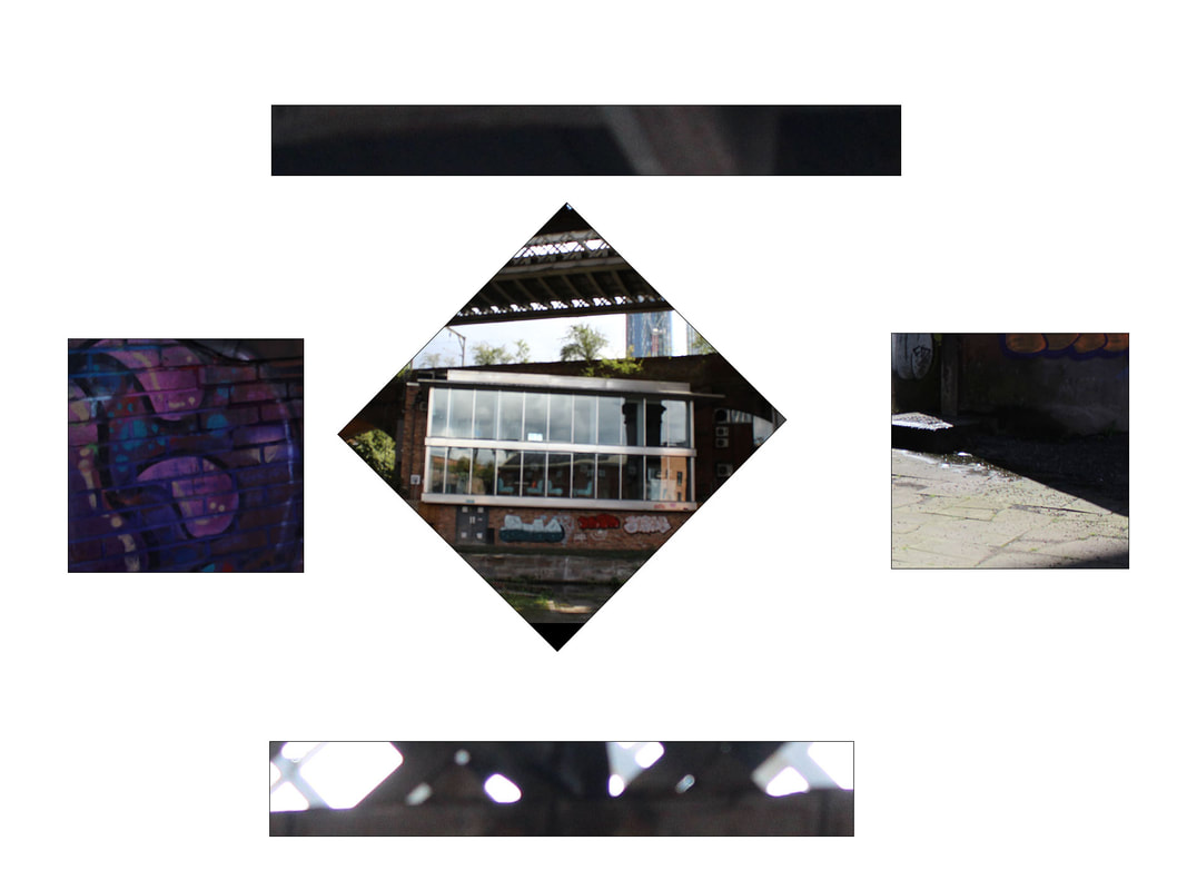
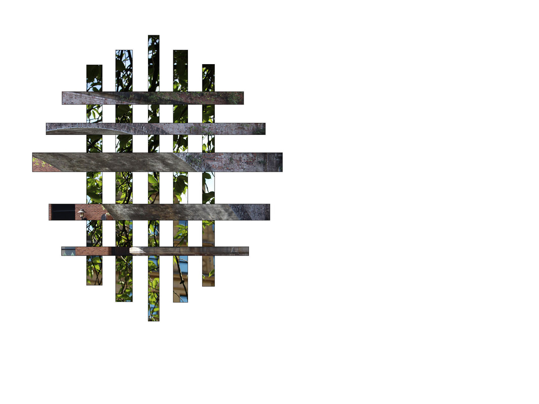
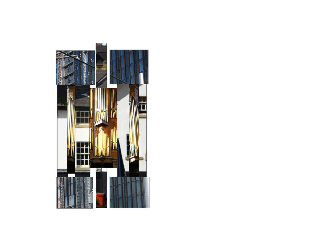
I have started to think about how to develop my work and have decided to chose a split panel technique as I thought it would be interesting to see patterns connecting through the different panels. I could weave both manmade and natural textures together to tell a story and to make patterns. I think this will help develop my Photoshop knowledge and skills and will let me explore different ideas and adapt as it as I go along because I think I can do quite a lot with this technique
1st experiment


Before
|
After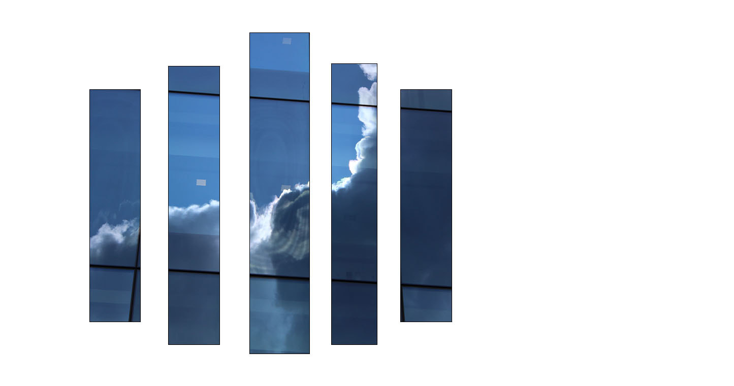
I like this first outcome because the clouds connect to each other across the panels but they also stand out with this format
|
2nd experiment


Before
|
After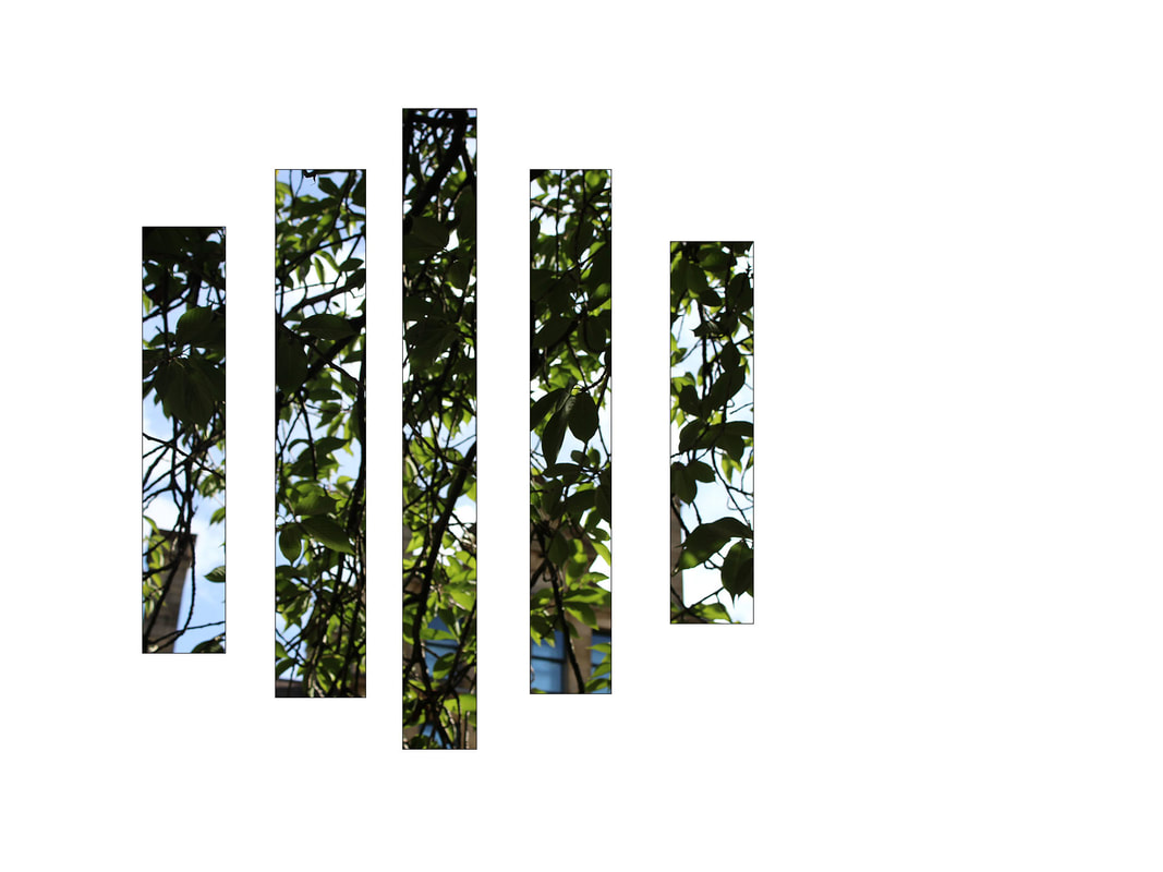
I think this is quite successful but will se if I can experiment a bit more on Photoshop
|
3rd experiment


Before
|
After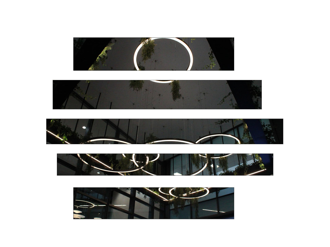
|
4th experiment


Before
|
After
|
I personally like this method a lot and may continue using this but using a variate of images and change where the shapes go , to than make the image look it's best.
5th experiment


|
|
After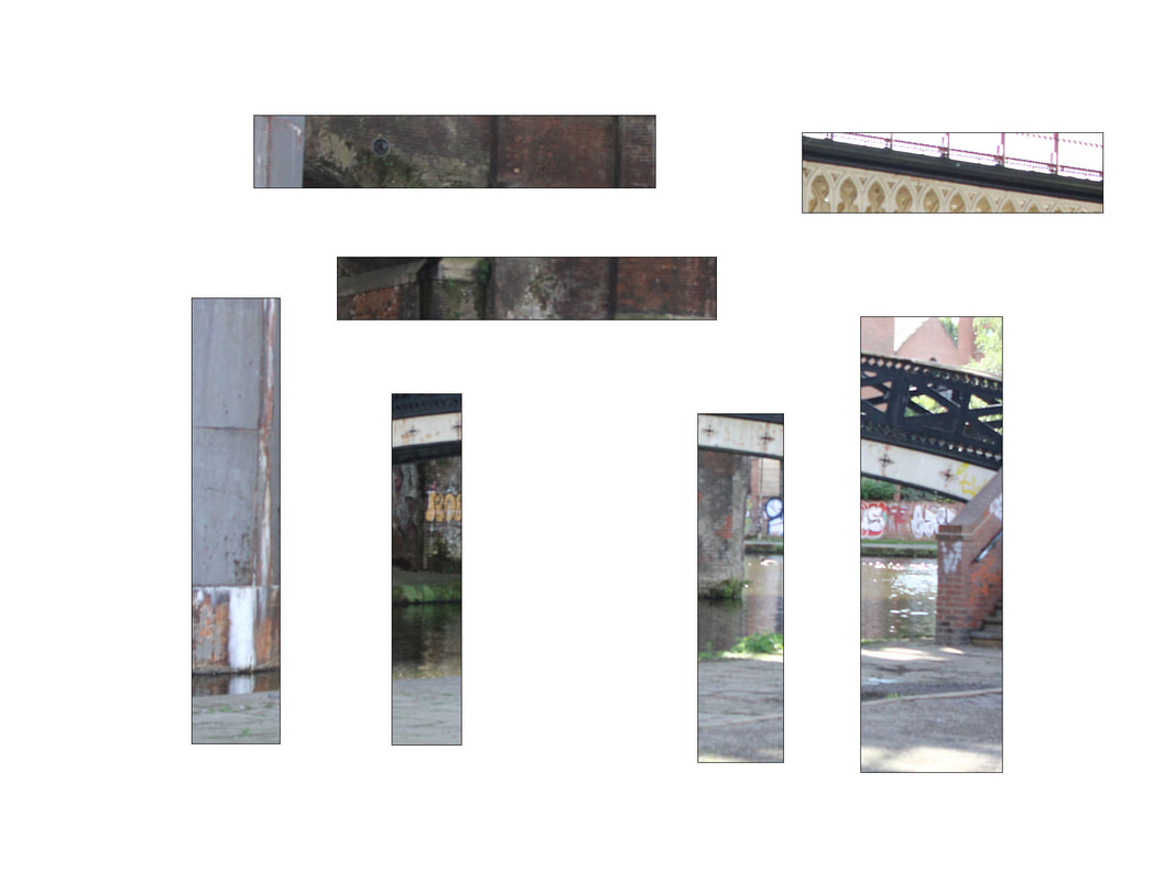
|
Next time to improve this I could of made two different panels. One where the bridge is at on the right side and the other one will be where the bridge is on the left side so . They will then look like they are connecting even though they are not even touching.
Tutorial I used
Geometric Shape Effect | Photoshop Tutorial - Bing video
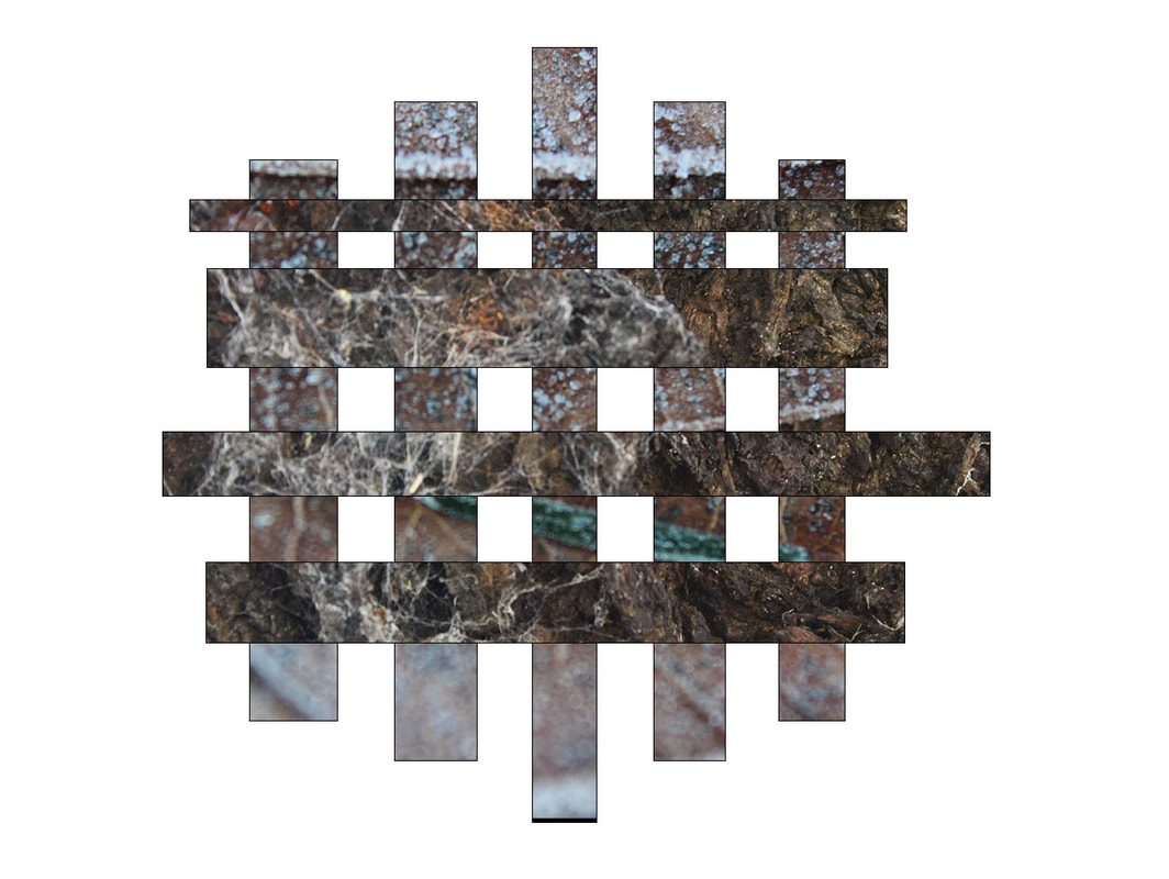
To develop my work a bit more and to stretch my knowledge on using Photoshop, I have been looking at different tutorials and I really like this geometric one. I think that I could extend my ideas by using different shapes to explore my ideas
Mood board


6thexperiment


Before
|
After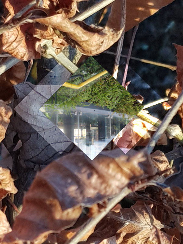
|
For my first attempt at this I find that next time I should find a background that is slightly better to than make the middle image stand out.
I think I will mix both the geometric technique with the split cavass technique to better improve my work instead of finding a better background just because when doing this I did not in joy it .
7th experiment


Before
|
After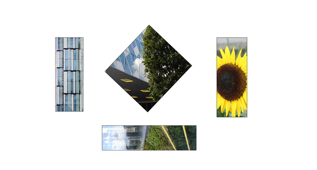
|
I personally really like this technique I used because I did not just end up doing the same shapes over and over again but I used more shapes this time to now make the images stand out from one another
Experiment 8


Before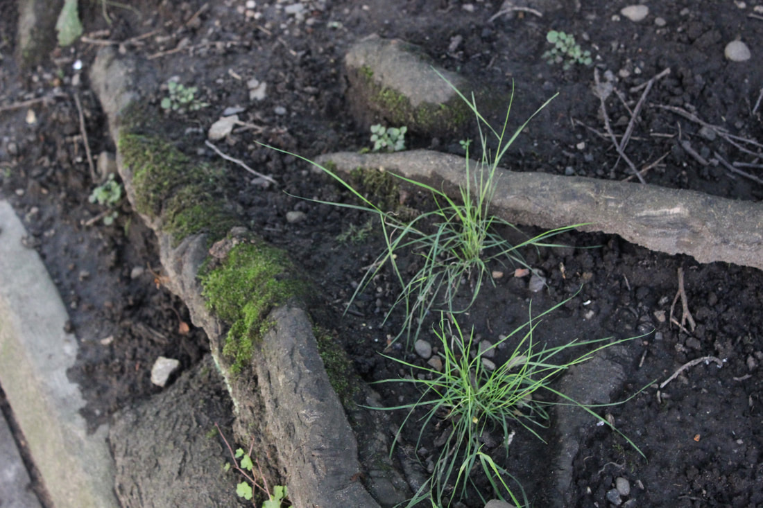
|
After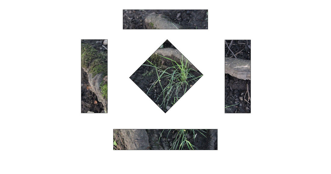
|
Next time I shall definitely use a more of a variety of shapes and patterns to truther more make my photoshop abilities be a whole lot better then they are now. I personally like what I had managed to make when using this image and panels and I also like how the far left panel and the bottom panel both connect. That is something I would really like to do in the future.
Experiment 9


|
|
Experiment 10


Original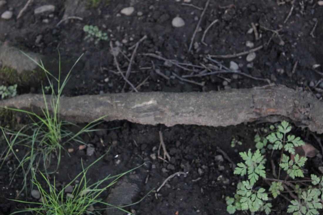
|
New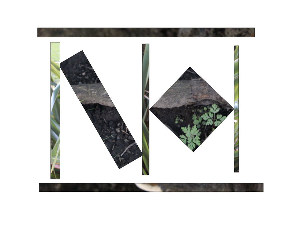
|
Experiment 11


Original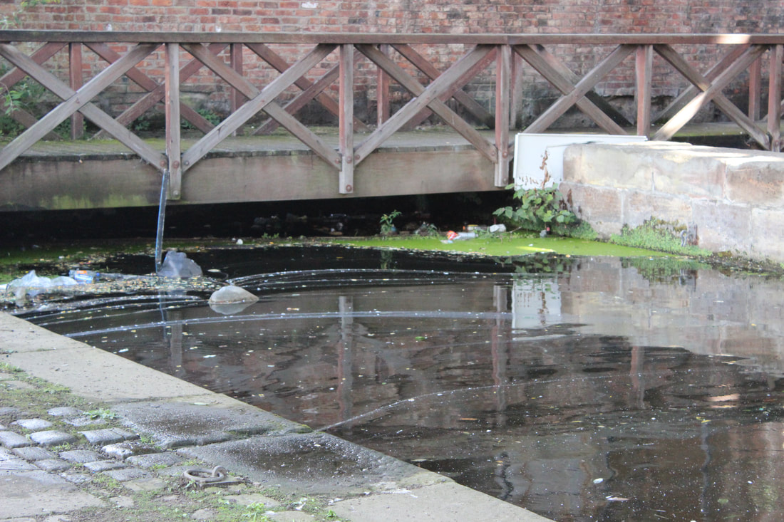
|
New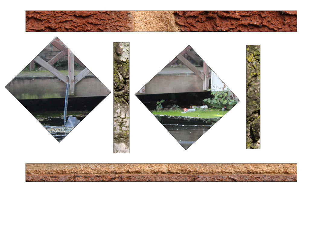
|
Experiment 12


Original |
New |

|
|
When I was thinking about my personal final gallery. I really wanted to do Manchester throughout time. The reason I chose Manchester was because I grew up near there and had some interesting memories from going there whenever I had spare time with my family members or if I went there on a school trip. I do not really go out that much except from going to events like comic con or megacon. My first three images will be mainly showing buildings with some sign of plant life. That then means my 4th and 5th image will show Manchester before it got introduced to buildings and mainly was only nature based. My final image will show a mix of man made and natural textures and images. I personally liked the use of the split panel technique and wanted to adapt it. This may be by overlapping them or making other shapes than the basic rectangles to then space them out in fun ways that will attract anybody's eyes. I went from doing just rectangles going to be facing up straight to then facing them to be landscape. I have then started to put the rectangles in different places and pointing other ways to then go onto overlapping the rectangles on my 4th image. It turns out that more colours are introduced when the buildings are being added. There are only really one or two colours when it is only the natural environment. These final images will inspire me in my next topic to help me understand the techniques I want to use and further help me understand what I can change and develop in photoshop.
Final gallery
|
|
|
|
|
|
|
|
Evaluation
For my first topic it was texture's in the landscapes and the different types of it. The textures that we were focusing on were man-made and natural. This could be taking a photo of shells , grass and trees or buildings , benches and bricks. In my personal opinion I preferred natural texture over man-made texture because of my interests are following nature and not the big cites. At the beginning of the project my hands would shake and I would always get final images I just hated caused they where too blurred and then I would have got stressed over that matter. I had always loved the idea of taking photos but never being in them because of my confidence problems. I still have this problem to this day.
Weebly is an amazing website where I can upload photos I took. Another thing I can do on Weebly is make a mind map , statement of intent and a shoot plan. I would also do research on photographers like Edward Weston and Paul Strand to help me better adapt my work in the long run. On Weebly I will have more than one page like how I have a home page, a textures in the landscapes page and a collections page.
As I get to a certain point in my journey I am able to use photoshop to better adapt my photos to add to Weebly. I personally like to use the split panel technique. I am able to explore more with this technique. For example I could turn the rectangles around to make different shapes or place them in different spots to catch the eyes of people but also I could overlap them.
In my photography class we all got to go on a trip. This trip was in to Manchester. We only went for the day and took as many photos as we could there. It turns out that a lot of my photos on this website is from the trip.
