Letter photography
A
|
B
|
C
|
D
|
E |
F |
G |
H |

I
M |

J
N |

K
O |

L
P |

Q
U
Y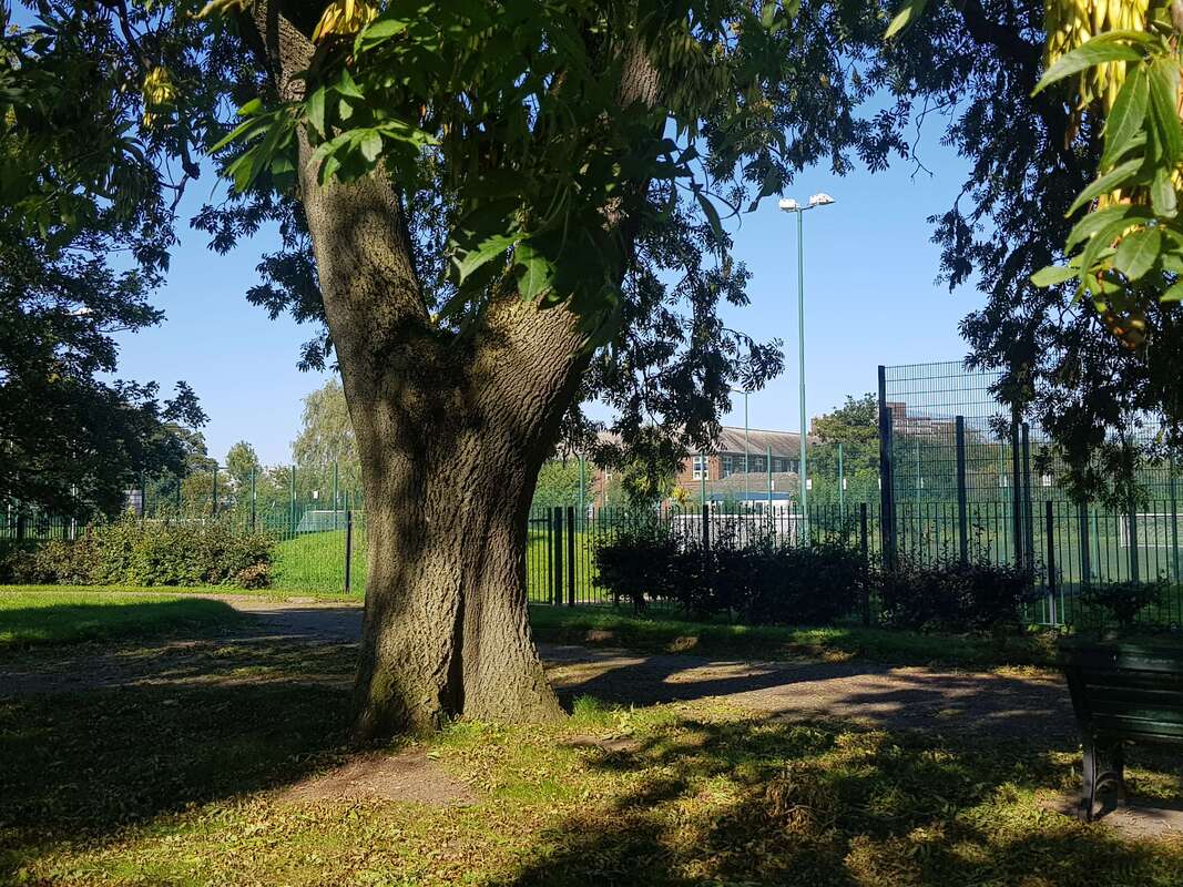
|

R
V
Z
|

S
W
|

T
X
|
Best and worst image
I believe that Y is the best letter out of all of them .One reason why this is my best is because of the use of line of focus. When I look at this image my eyes are instantly drawn to the tree (The letter). Another thing that makes this image look good is that the image is well focused and not burly. Keeping your image well focused is one of the many key things to make an image look good. Next time I might want to take it again but when there is less shadows to make the image slightly better.
I believe that M is the worst letter due to the titled angle that makes the letter harder too see and also the image is also tightly cropped. A way to make an improvement is to retake it from a new and better angle until you think it is better and to make the letter fully seen.
I believe that M is the worst letter due to the titled angle that makes the letter harder too see and also the image is also tightly cropped. A way to make an improvement is to retake it from a new and better angle until you think it is better and to make the letter fully seen.


