Statement of intent
Un like my other project that being 'texture'. I get to chose what I want to do. When looking at all of the options I found it semi hard to pick but I when I finally found what project I will do I knew it was for me. The project of my chose is 'objects'. Although I knew that I wanted to pick this one, I still had no idea what I will take pictures of and how it will be personal to me. I actually went from thinking that I will do old objects to now doing both discarded and beloved items instead. I feel like this project is personal to me in a way to show people what they have forgot and to show how it is not too late to remember these items before it's too late to remember and the objects are gone for good.
When doing this project I also had to find some photographers and talk about them by using the 4 c's. The 4 c's being 4 paragraphs of the names context, composition, connections and comments. These are a very useful tool for me when doing research about the photographers I am learning about. When thinking of photographers we had to pick two and there works' have to be similar to what I will hopefully be doing. The first photographer chosen is a man of the name Colin Wilson as for the second that is a women of the name Lisa Congdon. These two individuals have took photos of many different objects. I really like how both of the photos are different as Lisa Congdon will line up the objects and take a photo from above Colin Wilson shall stand up the objects and take a photo staring right at it so it is in the middle of the photo.
When I was first given the prompt that being objects I really wanted to take pictures of older and new objects but once I realized I would most likely not be able to complete this I than figured that I wanted to take pictures of discarded and beloved items. From this I felt more comfortable as after this I found new ideas on what I want to achieve in this. For example when doing photoshop I really want to combined the discarded and beloved items. I will then make a mind map and mood boards to further my understanding of the topic. I am hoping to take photos of things like rubbish, forgotten objects, dice and so much more. I think when begging this project I shall start making my mood boards and mind maps as then I can come up with even more ideas compared to now.
The DSLR camera will be the type of camera I shall use whilst taking the photos. I will more focus on learning and experimenting with different settings like the zoom or the sports mode. For home work I shall use my phone due to not having a camera my self. I shall continue using Weebly as my main site to store my knowledge and photos during these photography lesions. Photoshop will be explored more as I use it during my project I shall do. To make our mind maps and mood boards I shall use Canva as the main tool to further help making them. Because of my project being objects I shall need various different objects that you will end up being discarded or kept.
On my last project on photo shop I did the split multi panel technique but as I develop my learning with this new project I really want to combine the beloved items with discarded ones when using photoshop. I could also when taking photos change the settings to sports mode or the zoom feature as two examples. It also seems chaining the view point can easily develop my images due to me possibly finding some really good shots that are at a different angle. Even changing the location and time of time can easily improve my work. I can even start using my phone's camera instead of the schools camera when taking photos out side of school. To further improve my work I can make a mini movie or a small book.
When reflecting on my work as I go along I shall write my best and worst to all ways be able to see where I need to improve. Linking to this point I shall make mind maps and mood boards to get a better understanding of what I want to achieve when doing this topic. I can also take my work out of photography by making a mini movie or a book or weaving paper just to make my understanding reach out to other key learning opportunities that I will not be able to archive if I do only photoshop and anything else that I would work on in the computer. Once this is all completed I shall have the biggest opportunity to reflect and compare my first photos to those which are going to be in my finale gallery.
There are many things with in this project I hope to achieve, for example I hope my confidence with using the camera will improve and my ability to work independently will improve. I will need to become confident with that for my future exam and any other future path ways. I shall also work on my photo shop skills to further improve them as I only feel really confident with the split panel technique from the texture topic from last time. I will also need to improve my setting up of a studio shot as I do not feel like I am fully equipped with that ability as of this moment. I also feel like I shall also find a way to improve my research especially when finding photographers and tutorials. By doing this I know it will be hard so for now I can ask for help and get others advice for what I should do. Those others are people like other classmates and teachers or any other people I personally know like family members who have took GCSE photography as well to get further support when struggling.
Mind map

From this mind map I can get ideas of what type of objects I shall take pictures of.
Mood boards
objects not abandoned
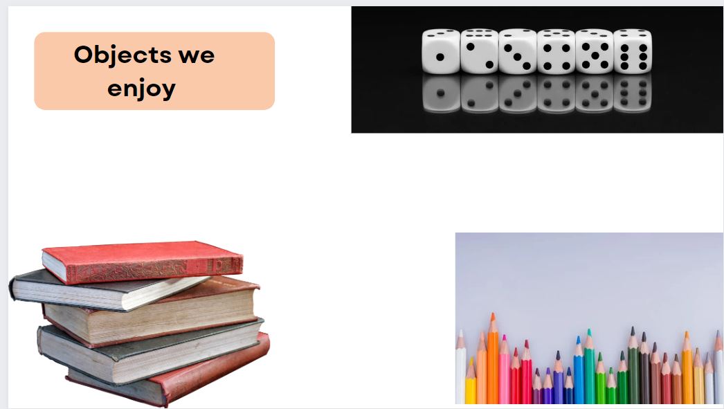


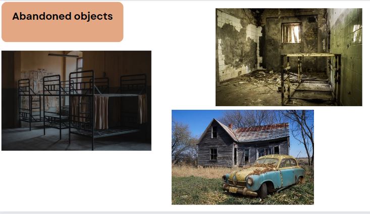
Objects that are abandoned

Research
Colin Wilson

Context
This information I have received is from
Exhibition | Artist Colin Wilson turns still lifes sinister: ‘Memory of Touch’ at Argentea Gallery | Ruth Millington
Exhibition | Artist Colin Wilson turns still lifes sinister: ‘Memory of Touch’ at Argentea Gallery | Ruth Millington
“From this information about Colin Wilson we can see that he lived from the '26th June 1931 – 5th December 2013' also 'He Is a 'photographer based in Derby' and 'His practice Is rooted in the still life and his long term projects focus on ‘rhopography, the depiction of that which Is considered insignificant'. It also seems ‘The simplicity of his compositions allows for a meticulous and expressive examination of carefully selected objects whose forms have immense force’. The whole reason he takes these types of photos are because ‘The objects that Wilson photographs act as conduits between our world in the present and the past. A monochrome analogue image is to some extent nostalgic, and speaks to the past.’ Another thing that links to that ‘The object holds its history, and its status is elevated through the photography process. By stilling time and making us pause to look at them up close, this work demonstrates the power of photography to make us stop and reflect for a while’.
Composition
This realistic image was made by Colin Wilson and is called 'memory of touch'. It seems to present us with a vase and a few lemons that sit on top of it. The whole name changes my views on this image as It tells us types of memories like how we may get memories from a familiar scent when food has been cooked. It seems this vase and lemons are important to him for some reason, however in the image the vase and lemons appear to be in the middle of the shot and it looks like they have no colours even the background has none. This is where two of the first techniques are being used, being the rule of 3rds and monochromatic. This image then personally stood out to me because of that. Thanks to the rule of thirds you will only focus your eyes on the lemons and vase because of the clear line where the wall and floor meets it shall then evenly help make that rule of 3rd’s due to it seems it has cut up the image into three. On the other hand if he did not use it you would end up being too distracted by the wall and floor that had gotten more patterns seen because of the use of monochromatic. Therefore when first look at the photo you shall see the lemons and the top part of the vase due to its interesting patterns and textures. Moving on to the next skill he has used it seems to be lighting. With this use the kiwis and vase seem to be in some form of spotlight that could also link to the skill framing due to the fact that they are in the light but seem to be surrounded by shadows. The shadows being the frame. This would therefore add a lot more to the image because with the light your eyes would focus there and not the shadows.
Connections
It seems Colin Wilson will link to my work due to the fact that we will both be focusing on objects with significance as for this ink painting from Dara Volvich can be easily linked to the work from Colin Wilson for many different reasons like how they both present us with a vase and something consumable which seems to be the main focal point in both images. To add, they both use the skill monochromatic in their work. Lastly they both have other things that would stand out but our eyes still focus on the vase and edible thing due to the rule of 3rd’s. This image stood out very well due to it not being the fanciest thing in the world like other art was made to be just like how Colin Wilsion’s work has also been done. I even feel Dara Volvich’s work can link to mine due to the similar things that both Colin Wilson and she do in their work even though one is a photographer and the other person is an artist.

Comments
In my opinion I believe this image stood out to me a lot especially when picking what I wanted to do in my personal topic. I believe it stood out due to the lack of color and lack of excitement in the other images show of when we look at it. The rule of 3rds was done amazingly as it stood out even thou the background was also slightly eye catching to me. I also like how it almost looks like it is in some spot light like how when preforming a dance , there would be spotlight on you so the audience can know where to focus there attention and so they can easily view the dance.
Lisa Congdon
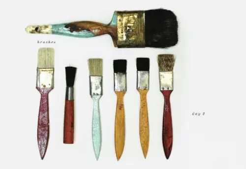
Context
This image was made by Lisa Congdon for one of her entries for 'A collection a day'. This is where people would make collages to present a different object each day. This tradition started in January of 2010. This was only her second entry. These objects where gotten from various shops and stalls where older items that where not good at there use where sold. As for Lisa Congdon she was an American fine artist but also an author and illustrator. She would make fine art for many people around the globe for them to buy. She is also believed to be self taught when it comes to art and had published around ten books.
Composition
This image of the name 'Brushes (day 2)' presents us with a few brushes that have a range of sizes and colors. They also seem to of been used quite a bit. I can see that because of the weir and tares it has, even some of the pant has came of a few some of the paint has came off. I believe she has held her camera above the focal point this could also lead to the idea of her using a shallow death of field due to the background being just one color and not going out wards. She might of also used the rule of 3rd's due to the fact that the brushes hit a lot of the sweet spots. I also believe there are easy to spot leading lines just following where the brushes are facing takes you on a journey. I personally believe that at the head of the brushes the rule of triangles have been used because your eyes normally gets drawn to that part first. When seeing it you can tell the rule of odds have been used because firstly there are an odd number of paint brushes but also one is way more bigger than the others that being the one that was above the smaller one but also the shortest one that is lining up with the rest is also odd due to its height and color. I actually find it more interesting in the way she has presented the brushes. She could of lined them up side by side by color or height but she did not do that for some reason.
Connections

This interesting collage was made by a French collagist of the name George Braque. This links back to Lisa Congdon's because they have both managed to make there own collages but there different in different ways like how Lisa Congdon used 3d objects and laid them out in a way they do not touch. On the other hand George Braque used pieces of paper and drawings to then lay them on top of each other when making his collage. Another difference is the colors when it comes down to George Braque he had seem to have only used browns, greys and whites as for Lisa Congdon she had used various colors like red , brown blue , yellow and a few more.
I personally believe that George Braque's work links to mine in the way that what I am wanting to do in photoshop this may be because when I do it I would really want to mix the loved items and hated items by overlapping them in many ways.
I personally believe that George Braque's work links to mine in the way that what I am wanting to do in photoshop this may be because when I do it I would really want to mix the loved items and hated items by overlapping them in many ways.
Comments
In my opinion I had enjoyed seeing this image just due to it reflecting her self. This is due to when your think of the brushes you would automatically think about an artist. She is an artist. Even the rust on the brushes can symbolize the idea of her doing art for a while. Just those two facts alone can show how important this image could be to her. This is why I enjoy this image.
Shoot plan
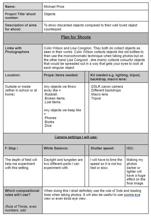
My first shoot: Discarded objects
Rubbish in nature


I know now I will need to do some indoor shoots to then vary the different types of images I will take for the project.
Crisps


Hat


Rubbish out side (man made edition)


This is personally a really good start. I should go out more to find more rubbish to take pictures of but at home I space them out so I can make things with them so they look more presentable and look more eye catching than before to then also get them a better chance of being used in photoshop.
My first shoot : items we keep / love
Dice


For my first shoot of items we keep and love I believe I just need to find a range of other images like postcards or pictures of family just to create more of a wide range of amazing images.
Best
In my opinion this is my favorite one due to the facts that every thing in a way stands out even the tiny writing that would normally not unless you want to read what you have rolled or for as similar reason like that. I personally like how there is a focus in the foreground and background. This will make the image stand out a lot.
|
Worst
This image does not look that bad until you see on the right side a dice bag has came into frame and around that area is slightly blurred. I could of stopped this from happening by moving the dice bag and changing the camera angle just so I will not make that mistake .
|
Discarded objects
Out door rubbish


Personally I found this shocking to find but it was really a good place for me to take photos there.


With the bin bags on top of the bins helped me take photos as it stood out to me it can also tell me that how easily our rubbish can over flow and get to hard to take care of that may be a reason why we get rid of stuff.


I believe I need to experiment more by taking some more images not just of rubbish I found but possibly some abandoned objects or objects some one accidently loses like a toy or a hat.
Inside rubbish


It is best to probably change the flooring use to see the difference and to see which is easer to use when taking the photos.


After that changing the flooring the images came out much better and I also found it easer to take the photos.


Best and worst
Best |
Worst |

I personally think this is the best. The plastic containers with the crisps could easily help the use of framing. I also feel a lot of texture is pulling threw because of the different types of rubbish used. This also brings a variety of colors.
|

This image is my worst for many reasons. Reason one being that the flooring use was picked badly. The second bad thing is that the objects seem to of fell almost into sloped part. It looks almost all right . The only problem is is that it was not the type of image I wanted to make.
|
Beloved items
Post cards


The post card idea work well it is always good to improve this by moving them around or even flipping them over to show the pictures only.


I feel like these photos mostly came out as slightly bad. I feel like I should of checked the settings on the camera to test it out to then also check the lights to make sure it is as bright as I want it to be.
Dice bag


This dice bag was amazing both the taking picture of it and the final results as the eye follows you it even managed to follow the camera.
Best and worst
Best
In my opinion I like this one the best due to the use of it being cropped and the light that reflects of the eye making it look like a real creature. I do like the image and I hope it will look good when I make my waived paper work as it will be fused with a image of an discarded object.
|
Worst
The main thing that made this the worst out of the 4 above will be the fact that is the use of lights and the position of the bag is all wrong. For example the over use of light takes out the mysterious element as for the position I do not like it due to you are able to see the blurred floor and background that was never men to been seen once the photo was done.
|


Personally my favorite two will be the best image from the best and worst and the 1st image on the last row of images. This is only for the dice bag not for the other images.
Dice


Best and worst
Best
|
Worst
|
|
In my opinion out of the 4 above this is the best. I personally in joy the idea of the shadows coming of the dice. I also like the use of foreground , middle ground and background. It seems to work really well in this photo.
|
This out of the 4 above is the worst. My hands must have moved slightly or something like that to make the photo to look like that. The use of foreground , middle ground and background would have been good but because of the blur it does not work as well as it should.
|


Best and worst
Best
Out of the 5 above this is the best. The use of cropping could have been better but still with the photo looks good. I like how some dice look like they are standing on another one and how because the the different types of dice and colors it more draws your eyes in to view the photo.
|
Worst
Out of the 5 above this is the worst. The blur was there because of my hands moving as for the bad use of cropping it may of been because of my hands moving or it was done on purpose.
|


Books


Best and worst
Best
This is personally the best out of the images of the Tolkien books due to the amazing use the rule of 3rds as you would mainly only focus on the middle one even thou it has an distracting base and things to the side of it. To improve this work I can slightly move the main focus slightly so it will be fully in the middle.
|
Worst
It was hard to pick the worst image out of the pictures I took. I had chose this one because of it being blurred this may have happened because of ether my hands shaking or I moved too fast to check the image. Next time if I want the image to be better than this I shall take my time when taking it just so I know the image will be great.
|


Headphones


Photoshop
It seems that in photoshop to improve my images I would love to mix both the discarded and beloved object photos together in a way to shed light back to them and to remind people of those memories of the old items.
Tutorial I used

I had also got inspiration from my last project where I did the split multi panel when doing my manmade and natural topic.
First attempt


Before

|
after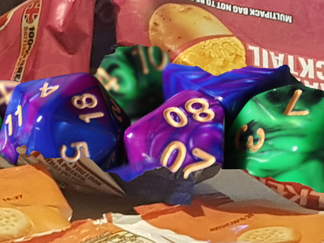
|
I believe after this first attempt I do enjoy combining the images once I got used to it but next time I should figure out different ways I can fuse the two images and to also plan out which images before hand when doing this.
My next steps in the project
When starting to continue and develop my project I shall look into different ways of combining the discarded objects and beloved objects. Once I have I shall make a mood board or two just to show my ideas and to get a better understanding of what I will be doing for my next steps. I am doing this to add more meaning to my work or else it shall just be discarded objects plus beloved objects put together for no reason.
Mood board 1


In these photos there will be a person and then objects over there head. This can be to show there imagination , hopes and dreams. I can most likely do something like this but with objects, some we love and cherish or have gotten rid of and forgotten to then add meanings to my photos.
Mood board 2


In these two images we can see the classic collage. I feel like I am able to further develop this in my work as I can make this manually and use both the discarded and beloved objects.
Which mood board I chose
After considering both options I believe the mood board that I will take inspiration from and make my final gallery based on is the second one. I think I had resorted to this one was because I find it sort of difficult to take photos of other people and myself. Now the only sort of difficult parts to now complete is to find a tutorial and find a way to make this some how personal to me.
Tutorial

When looking threw different tutorials I found it really hard due to the videos mainly covered other ways of making collages in photoshop. Those that were different to the way I wanted to do it. From this point I have two options I shall ether do this in photoshop or make the collage manually.
Shoot plan

This shoot plan can now help me further understand what I need to do for my next steps in the project.
1st experiment
Before |
After |
